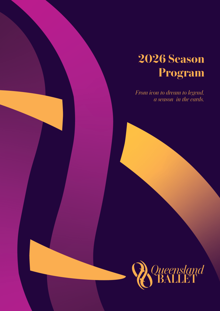
This project was to help Queensland Ballet stand out from their competition with a new, bold and vibrant visual identity applied to their 2026 season brochure and an animated poster.
The mark represents the elegant and flowing movements of dancers. It is an interpretation of two dancers’ sweeping arms as they form bras en couronne.
The logo uses a classically styled serif typeface in both regular and italic variants to emphasise the spectrum of Queensland Ballet’s performances.
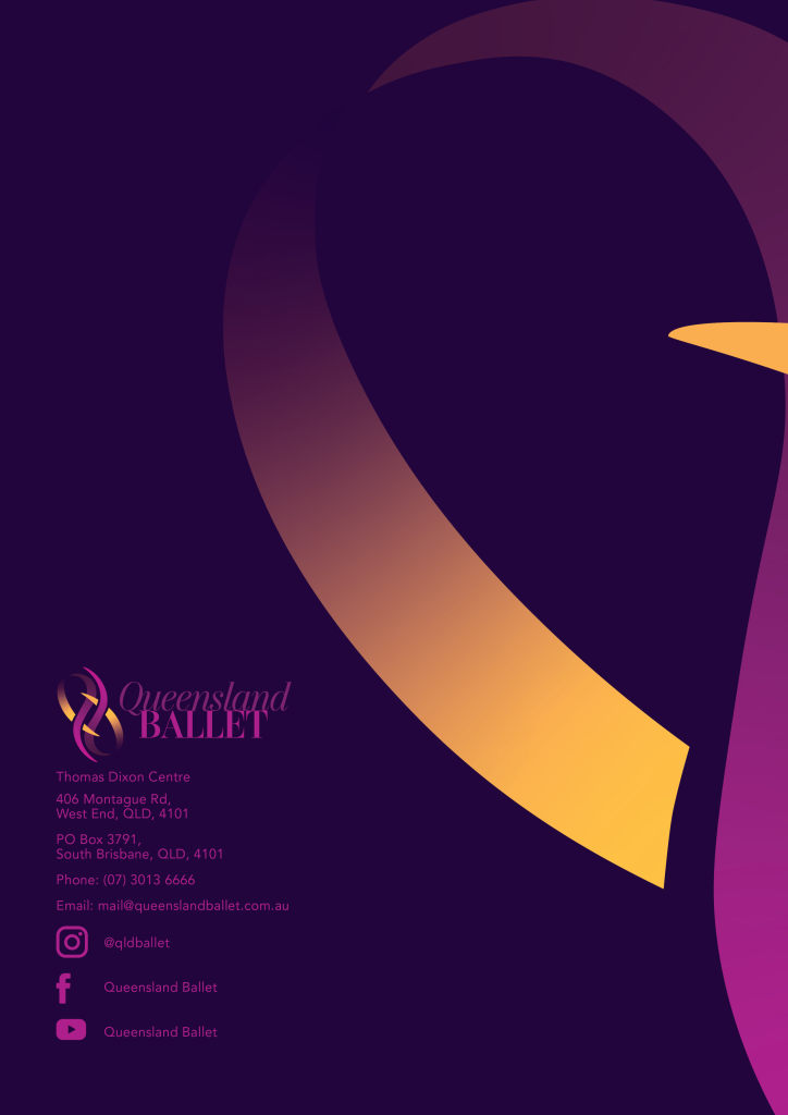
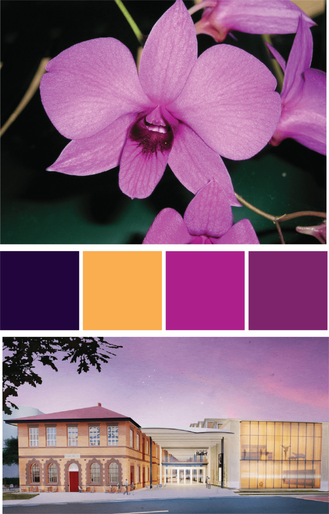
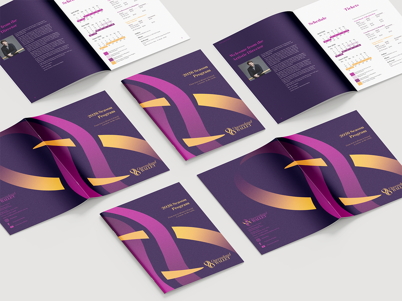
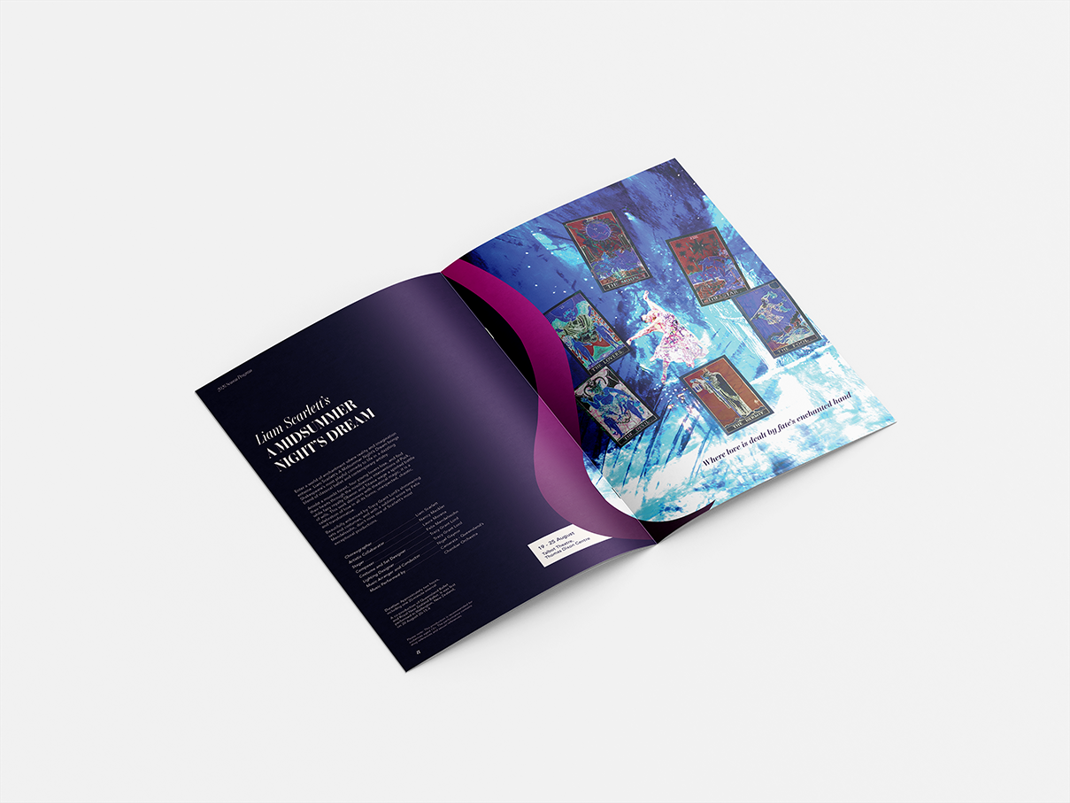
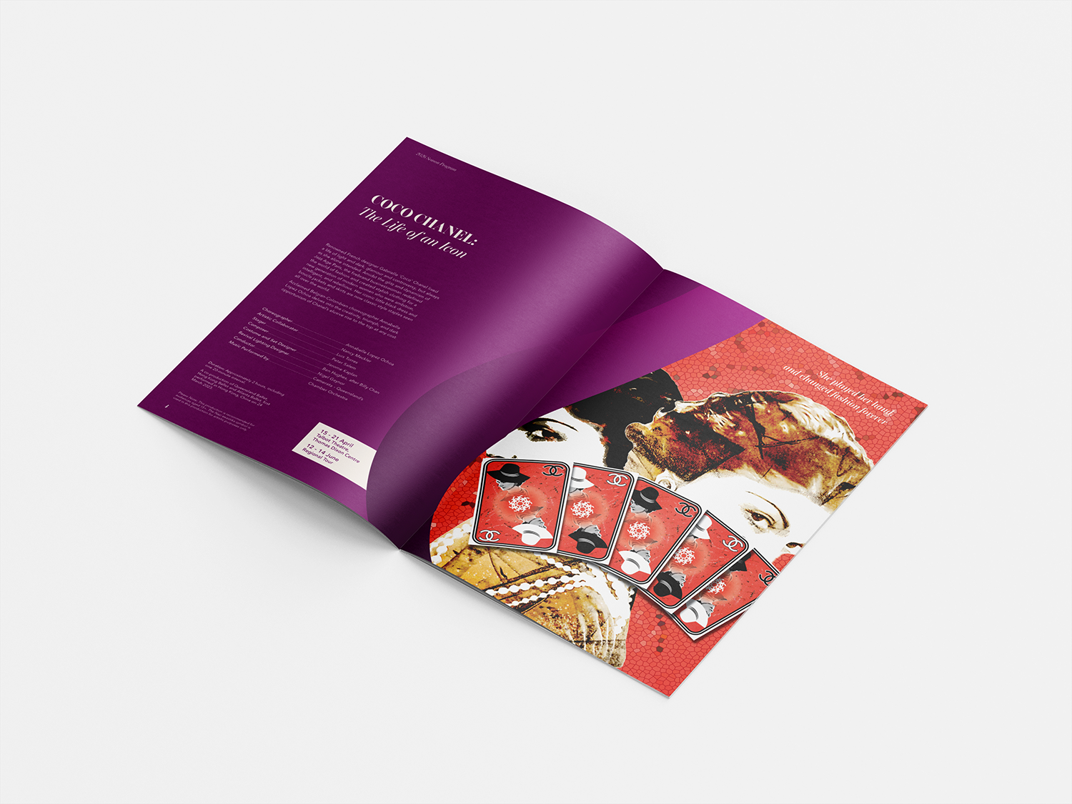
The mark and colour palette are used to create interesting frames for performance images and contrast across spreads in the program.
A strong grid structure for type aids readability while contrasting against the multifaceted art opposite.
Text based content is set in a clean rounded san serif typeface and headings use the brand typeface connecting back to the visual identity.
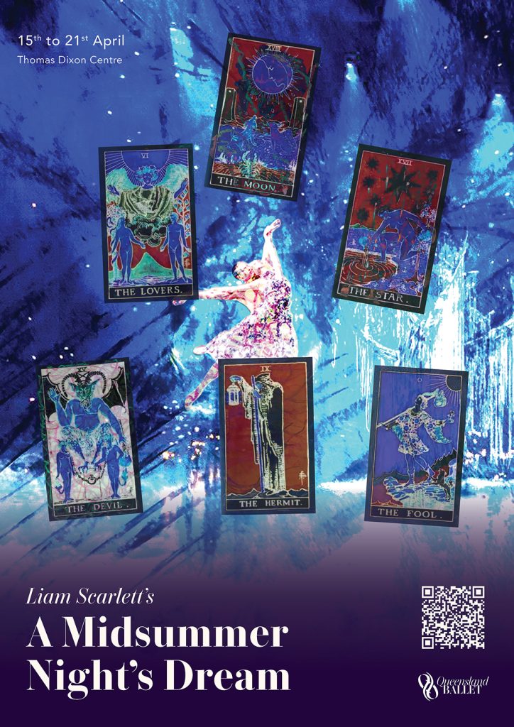
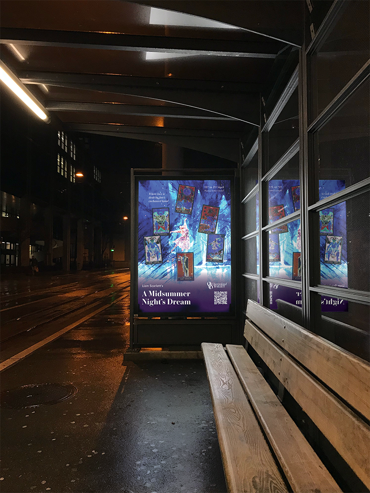
The animated poster adds stylised motion to the performance art from the program to better attract attention.
The visual identity is carried through in application of the logo and use of the same typefaces in a final reveal.