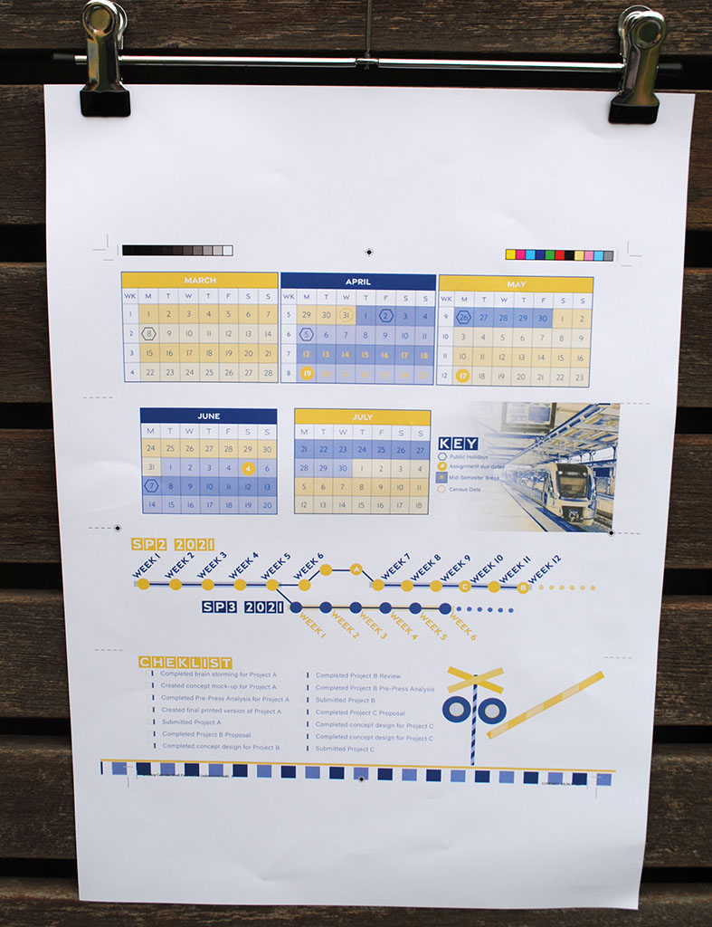
This desktop calendar was created as part of a university assignment. The purpose was to create a time analogy that could be featured on a desktop calendar.
This project showcases my ability to create vector graphics, desktop publishing and using only two colours.
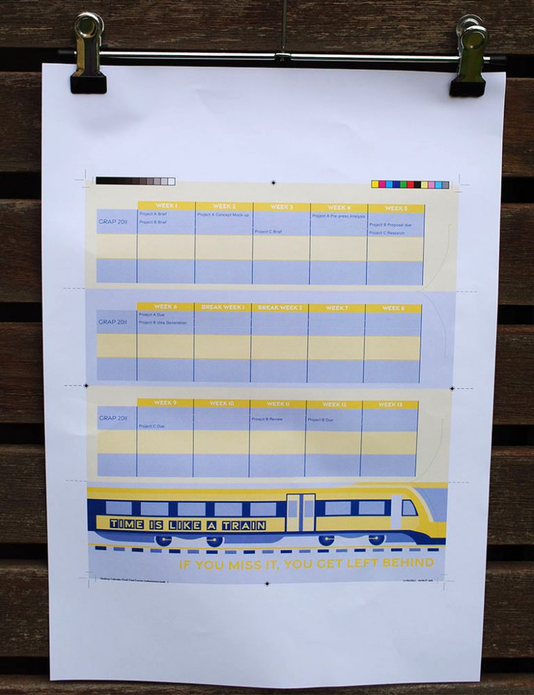
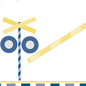
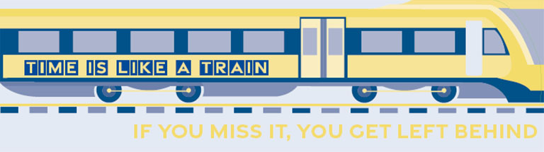
The following vector graphics were created in order to carry the train theme throughout the calendar.
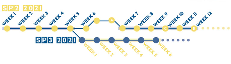
I use the idea of a route map to represent the weeks that occur within a study period, and the branching to show when the next study period starts.
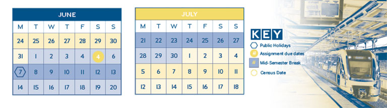
Repetition features heavily throughout this design with the use of alternating rows in tables and striped elements to represent rail tracks.
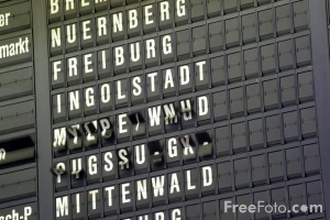
The main font that I chose fit within the theme as it reminded me of the font used on the old fashioned timetable boards where each letter is on an individual spindle and flick through until the right letter is visible. This font fit within the theme and with each character fitting within a rectangle added an extra way to incorporate colour within the text.